
Project
Bernardo Évora
Introduction
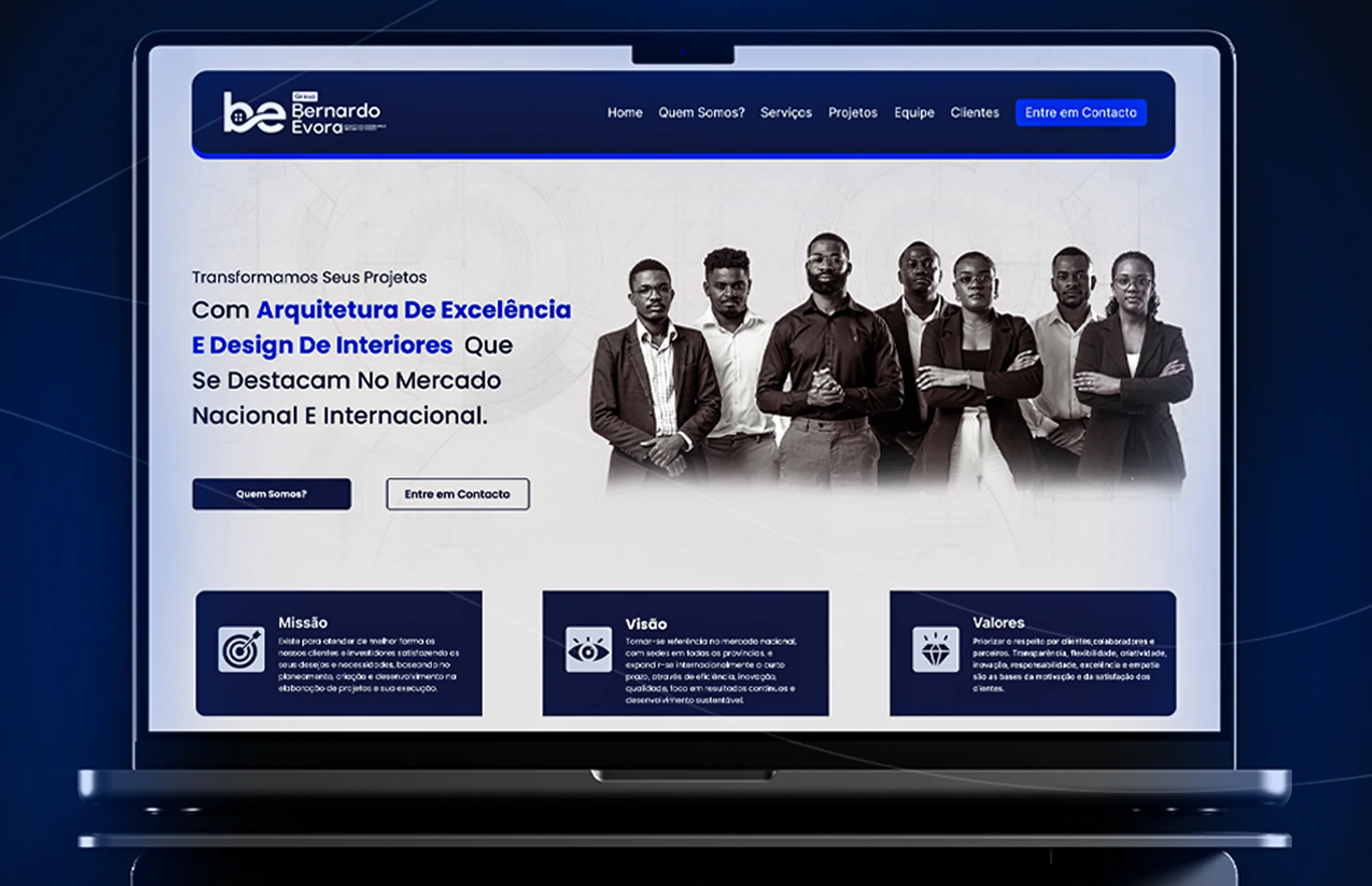
Bernardo Évora is an architecture, engineering and interior design firm. We designed its website to present the team, the services and the projects with the same clarity the firm brings to designing spaces.
- Year
- 2025
- Industry
- Architecture
- Engineering
- Interior design
- Service
- Corporate website
- UX/UI
- Solution
- Website
- Platform
- Web
- Mobile
The scenario
A firm of projects that needed a website worthy of its projects.
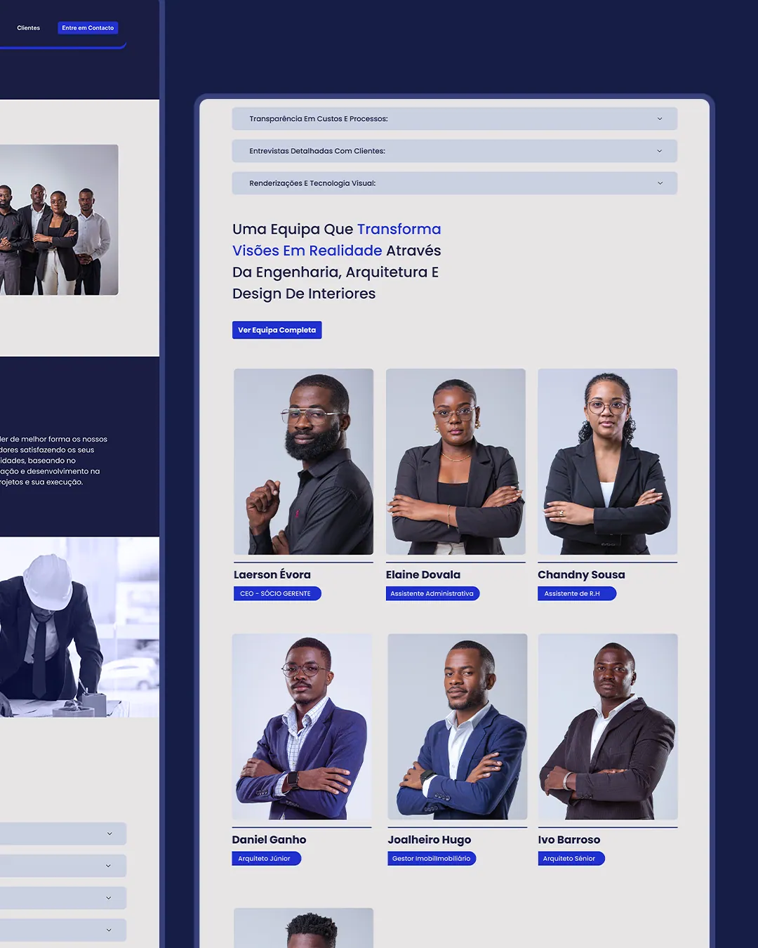
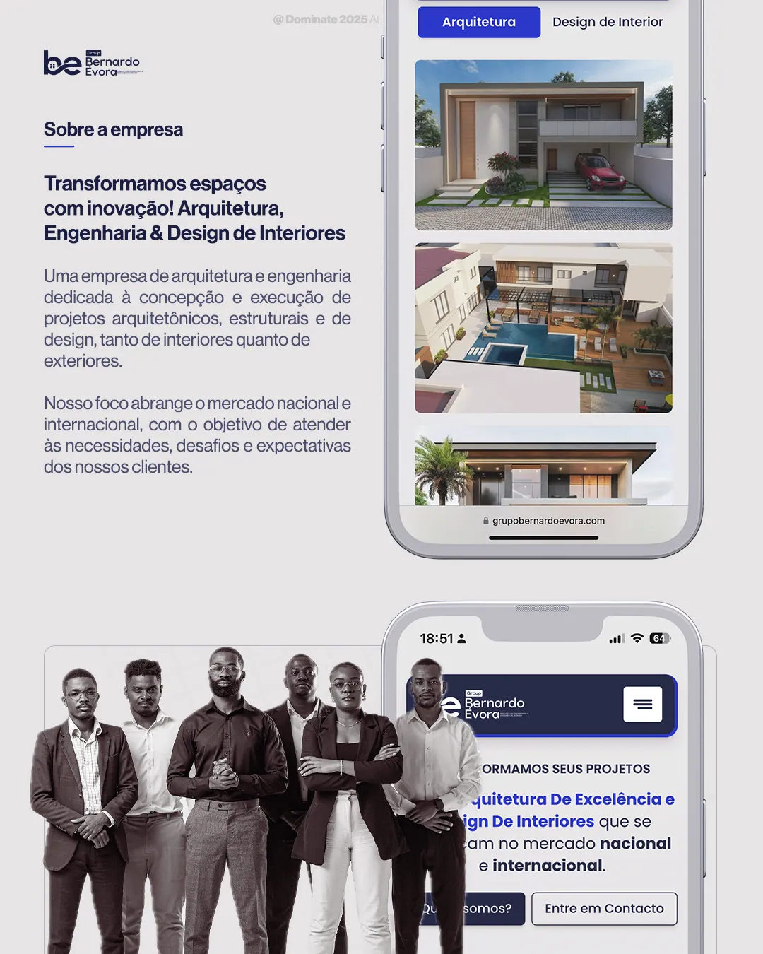
Bernardo Évora works in architecture, engineering and interior design for the national and international market. The website had to explain all of that at a glance, give the team a face and show the work without getting lost in text.
Typography and colour
The project's visual language.
Typography and palette set the tone of every screen: a readable family and a short palette, with supporting tones for states and surfaces.
Inter
A sans serif designed for digital interfaces, with strong on-screen legibility and a wide range of weights.
Primary
Night Blue
HEX#181E44
Secondary
Lavender Blue
HEX#7B83D7
Neutral
Mist Grey
HEX#E2E1E4
Neutral
Black
HEX#040404
Challenges
Three disciplines, one message.
- 01Present architecture, engineering and interior design without blurring the three.
- 02Give the team and its credibility the spotlight.
- 03Show mission, vision and values directly.
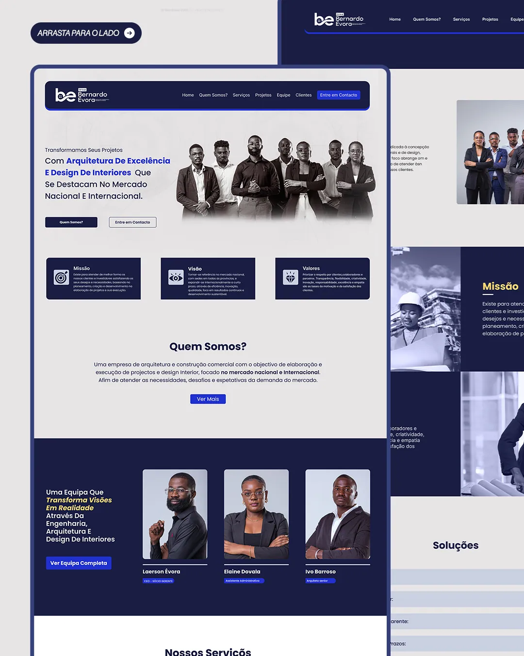
- 04Organise services, projects and clients into simple navigation.
- 05Keep the same clarity on phone and desktop.
Results
A digital presence worthy of the quality of the projects.
The website now presents the firm, the team and the services clearly and consistently, in a sober dark-blue design that conveys trust and works just as well on small and large screens.
Keep exploring
More projects

Have a similar project?
Tell us the context. We help turn the need into a clear, buildable solution.
Talk to us